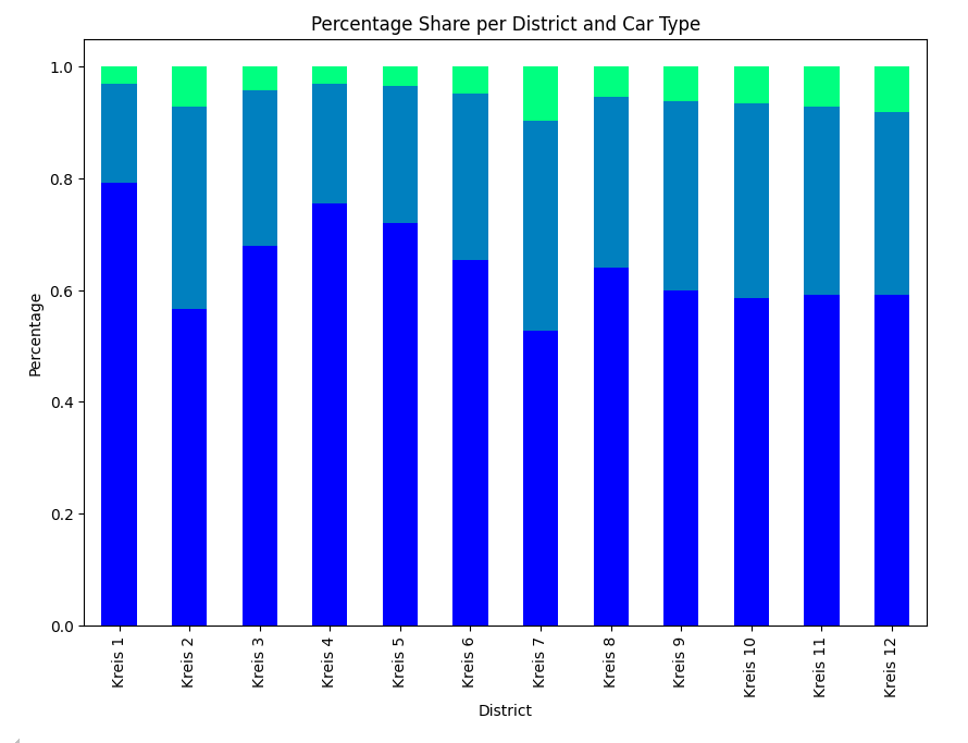
In this blog post, we will explore how to use Python’s groupby function to analyze and visualize data. Our dataset provides information about car ownership per household in different districts of Zurich. This dataset is available on the Open Data Zurich platform. We’ll demonstrate how to use the groupby function to extract meaningful insights from the data.
What the Dataset is About
The dataset contains information about the number of cars per household across various districts (Kreise) of Zurich for different years. Each row in the dataset represents a specific district and the number of households with a certain number of cars.
Our Goal
We want to calculate the distribution of car types per district in Zurich to the most current data which is 2023 for this dataset.
Step-by-Step Explanation of the Code
Let’s dive into the code and explain each part step by step, focusing on the use of the groupby function.
1. Importing Necessary Libraries
First, we need to import the libraries that we’ll use for data manipulation and visualization.
import pandas as pd
import numpy as np
import matplotlib.pyplot as plt
import seaborn as snspandas: For data manipulation and analysis.numpy: For numerical operations.matplotlib: For creating static, animated, and interactive visualizations.seaborn: For making statistical graphics.
2. Reading the CSV File
We will read the CSV file into a DataFrame. Make sure the CSV file is in your working directory or provide the correct path to it.
df = pd.read_csv('Personenwagen pro Haushalt nach Stadtquartier.csv')3. Renaming Columns
To make the column names more understandable, we rename them appropriately.
df = df.rename(columns={
    'StichtagDatJahr': 'Year',
    'KreisLang': 'District',
    'AnzPWHHLang_noDM': 'Car_Type',
    'AnzHH': 'Household_Count'
})
This is what our dataset looks like now. With the head() function we can look at the first rows of our dataset.

4. Filtering Data for the Year 2023
We filter the data to include only records for the year 2023.
df_2023 = df[df['Year'] == 2023]5. Grouping Data by District and Car Type
We group the data by district and car type, summing up the number of households for each group. This is where the power of the groupby function comes into play.
df_grouped = df_2023.groupby(['District', 'Car_Type'])['Household_Count'].sum().reset_index().rename(columns={'Household_Count': 'Count'})groupby(['District', 'Car_Type']): This groups the data by the columns ‘District’ and ‘Car_Type’.['Household_Count'].sum(): This calculates the sum of ‘Household_Count’ for each group.reset_index(): This resets the index to turn the grouped data back into a DataFrame.rename(columns={'Household_Count': 'Count'}): This renames the column for clarity.
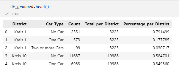
This is what df_grouped eventually looks like.

6. Calculating Total Households per District
We calculate the total number of households in each district.
df_grouped['Total_per_District'] = df_grouped.groupby('District')['Count'].transform('sum')7. Calculating the Percentage Share per Car Type in Each District
Next, we calculate the percentage share of each car type within each district.
df_grouped['Percentage_per_District'] = df_grouped['Count'] / df_grouped['Total_per_District']
8. Defining the Order of Districts
We define the order in which the districts will be displayed in the plot.
district_order = ['Kreis 1', 'Kreis 2', 'Kreis 3', 'Kreis 4', 'Kreis 5', 'Kreis 6', 'Kreis 7', 'Kreis 8', 'Kreis 9', 'Kreis 10', 'Kreis 11', 'Kreis 12']9. Restructuring Data for the Bar Plot
We restructure the data to create a pivot table suitable for a stacked bar plot.
df_pivot = df_grouped.pivot(index='District', columns='Car_Type', values='Percentage_per_District').reindex(district_order)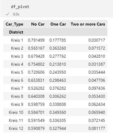
10. Creating the Stacked Bar Plot
Finally, we create and display the stacked bar plot.
df_pivot.plot(kind='bar', stacked=True, figsize=(10, 7), colormap='viridis')

# Adding labels and title
plt.xlabel('District')
plt.ylabel('Percentage')
plt.title('Percentage Share per District and Car Type')
plt.legend(title='Car Type', bbox_to_anchor=(1.05, 1), loc='upper left')

# Display the plot
plt.show()

Conclusion
In this blog post, we demonstrated how to use Python’s groupby function to analyze and visualize car ownership per household across different districts of Zurich. By grouping data by district and car type, we were able to calculate and visualize the percentage share of each car type within each district. This example illustrates the power of the groupby function in making data analysis accessible and insightful for beginners. Happy coding!
How did you like this tutorial? Let me know your thoughts. Any feedback is appreciated.
The Complete Code
# Import libraries
import pandas as pd
import numpy
import matplotlib.pyplot as plt
import seaborn as sns

# Read the CSV file into a DataFrame
df = pd.read_csv('Personenwagen pro Haushalt nach Stadtquartier.csv')

# Rename columns for better readability
df = df.rename(columns={
    'StichtagDatJahr': 'Year',
    'KreisLang': 'District',
    'AnzPWHHLang_noDM': 'Car_Type',
    'AnzHH': 'Household_Count'
})

# Replace specific values in the 'Car_Type' column for consistency
df = df.replace({'kein Personenwagen': 'No Car', 'ein Personenwagen': 'One Car', 'zwei oder mehr Personenwagen': 'Two or more Cars'})

# Display the first few rows of the DataFrame to check the changes
df.head()

# Filter the DataFrame for the year 2023
df_2023 = df[df['Year'] == 2023]

# Group by 'District' and 'Car_Type', and sum the 'Household_Count' column
df_grouped = df_2023.groupby(['District', 'Car_Type'])['Household_Count'].sum().reset_index().rename(columns={'Household_Count': 'Count'})

# Display the first few rows of the grouped DataFrame
df_grouped.head()

# Calculate the total number of households per district
df_grouped['Total_per_District'] = df_grouped.groupby('District')['Count'].transform('sum')

# Calculate the percentage share per car type in each district
df_grouped['Percentage_per_District'] = df_grouped['Count'] / df_grouped['Total_per_District']

# Display the first few rows of the updated DataFrame
df_grouped.head()

# Define the order for sorting the districts
district_order = ['Kreis 1', 'Kreis 2', 'Kreis 3', 'Kreis 4', 'Kreis 5', 'Kreis 6', 'Kreis 7', 'Kreis 8', 'Kreis 9', 'Kreis 10', 'Kreis 11', 'Kreis 12']

# Restructure the DataFrame for the bar plot
df_pivot = df_grouped.pivot(index='District', columns='Car_Type', values='Percentage_per_District').reindex(district_order)

# Plot the data as a stacked bar chart
df_pivot.plot(kind='bar', stacked=True, figsize=(10, 7), colormap='winter')

# Add labels and title to the plot
plt.xlabel('District')
plt.ylabel('Percentage')
plt.title('Percentage Share per District and Car Type')
plt.legend(title='Car Type', bbox_to_anchor=(1.05, 1), loc='upper left')

# Display the plot
plt.show()

# Read the CSV file into a DataFrame again for the second part
df = pd.read_csv('Personenwagen pro Haushalt nach Stadtquartier.csv')

# Filter the DataFrame for the year 2023
df2 = df[df['StichtagDatJahr'] == 2023]

# Group by 'KreisLang' and 'AnzPWHHLang_noDM', and sum the 'AnzHH' column
df3 = df2.groupby(['KreisLang','AnzPWHHLang_noDM'])['AnzHH'].sum().reset_index().set_axis(['District', 'Car_Type', 'Count'], axis=1)

# Calculate the total number of households per district
df3['Total_per_District'] = df3.groupby('District')['Count'].transform('sum')

# Calculate the percentage share per car type in each district
df3['Percentage_per_District'] = df3['Count'] / df3['Total_per_District']

# Define the order for sorting the districts
district_order = ['Kreis 1', 'Kreis 2', 'Kreis 3', 'Kreis 4', 'Kreis 5', 'Kreis 6', 'Kreis 7', 'Kreis 8', 'Kreis 9', 'Kreis 10', 'Kreis 11', 'Kreis 12']

# Restructure the DataFrame for the bar plot
df_pivot = df3.pivot(index='District', columns='Car_Type', values='Percentage_per_District').reindex(district_order)

# Plot the data as a stacked bar chart
df_pivot.plot(kind='bar', stacked=True, figsize=(10, 7), colormap='viridis')

# Add labels and title to the plot
plt.xlabel('District')
plt.ylabel('Percentage')
plt.title('Percentage Share per District and Car Type')
plt.legend(title='Car Type', bbox_to_anchor=(1.05, 1), loc='upper left')

# Display the plot
plt.show()

# Plot the data again for consistency in presentation
df_pivot.plot(kind='bar', stacked=True, figsize=(10, 7), colormap='viridis')

# Add labels and title to the plot
plt.xlabel('District')
plt.ylabel('Percentage')
plt.title('Percentage Share per District and Car Type')
plt.legend(title='Car Type', bbox_to_anchor=(1.05, 1), loc='upper left')

# Display the plot
plt.show()
